Categories
Uncategorized

VFX Festival


I attended the VFX Festival 2017! This was a great event, held at the Rich Mix cinema in Shoreditch. It featured presentations and talks from companies and industry professionals from across the Visual Effects, Animation and Games sectors. Going behind the scenes and watching the breakdown videos from some of the year’s most talked-about films and animations was truly incredible and very inspiring.

A whole range of projects from many different companies were discussed at various talks throughout the day. Some of my favourite sessions from the festival included insights into the creation and destruction of Jedha in Rogue One: A Star Wars Story, the compositing process for battle scenes in Star Trek Beyond, the modelling of CGI characters for the John Lewis Christmas advert, and a lot more besides. 

Many of the leading VFX companies attended and I was able to speak to them in between attending the talks. It was great to see what they’re currently working on and get an understanding of what it would be like to work within the VFX or Animation industries. 

Categories
3D Modelling

RC Car Animation

The VFX Compositing assignment for the first term of my second year at university was to plan, shoot, edit and render a composite shot of a three-dimensional remote-control car into a location from around campus. Overall, I’m very pleased with my final outcome, and thoroughly enjoyed the assignment. It was a first proper taste of what it would be like to work on a visual effects shot for a film.

colour-chrome.png

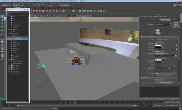
The first stage was to decide on a location and collect all the relevant information. I chose a bench as I wanted the car to circle around and go underneath it. After setting up the Sony FS-7 camera and tripod, I identified a baseline and measured the dimensions of the bench and the distance from the camera to ends of the baseline. I then filmed a series of reference shots, using a chrome ball, grey ball and colour chart that I can refer to later in the process. Finally, I took a panoramic High Dynamic Range Image (HDRI). This involved taking a series of photos at a range of different exposures, at 60 degree intervals. These images were then stitched and combined using HDRI software PTGui. I created an undistorted version of the backplate footage using a 35mm Lens Grid to assist me with camera matching.

The next step of the process was to add the 3D car to the blank backplate that  I filmed on location. In order to do this successfully, the dimensions and baseline measurements helped me to match the real life camera to a virtual camera in three-dimensional design software Maya. Once the cameras were lined up and matched, the rest of the bench geometry was then modelled. The car was then referenced into the design space and animated to follow a specific path through my scene, looping around and under the bench. Using VRay Object Properties enabled me to generate correct shadows for underneath the car, and the shadows that the bench would cast on the car itself. I then used two render layers to export a Beauty Pass and Shadows Pass.

picture1

The final stage was to composite the finished shot using Nuke. As well as the two render layers, I also exported a number of AOVs or render elements, including Reflections, Refractions, Specular, Lighting, Velocity and zDepth. These needed to be distorted to match the original backplate footage, before I built up the car element by element. The only task left was to render from Nuke to a HD 1920 x 1080 H.264 file.

Filming – Compositing – HDR Images – Network Rendering – Maya 2017 – NukeX – PTGui – Undistorting – Camera Matching – Animating – Keyframing – AOVs – Stitching Panoramas – Render Layers – VRay

Categories
Blog

Blog: Compression

29/11/16 – Compression

When producing and exporting videos, one of the main features for consideration is the video format and the file format. These two terms are often mistakenly used interchangeably, however there is a distinct difference.

The file format is the extension to the end of the filename. Common examples in everyday life include .docx, .pptx, .pdf and .exe. Those more related to video and film include .mov, .flv, .exr, .tiff and .avi. The file format will decide what type of application can open, read and handle the file. For example, VLC media player can accept most of the common file types. Apple iPhones and iPads however cannot read or open flash files.

vm_videocodecs_00

The video format, sometimes called the codec, determines how compression is added to the data itself. Common examples include Animation, Apple ProRes, H.264, REDCODE and XDCAM. The video format largely determines the quality of the file once it has been opened in an appropriate piece of software.

Some video formats are described as ‘lossy’, and others as ‘lossless’. This is because of the differing ways in which video codecs compress the files. A .raw image file is lossless, because the camera records all of the light information that the sensor records – this can result in very large file sizes. However, a .jpeg, for example, is a lossy format. As the file is compressed, some of the sensor data is thrown away. Under normalcircumstances, the effect is not noticed, and file sizes are greatly reduced. If the compressed images are enlarged too much, however, the result of the compression can be seen as the image would not be clear.

Another way to describe the quality of audio or video files is bitrate. This is a measure of the amount of data transmitted in a given amount of time, usually a second – either Kbps (Kilobits per second), Mbps (Megabits per second) or less commonly Gbps (Gigabits per second).

Below are four videos. They all have exactly the same content, but each is encoded with different settings. The first one is a lossless compression with a 10/10 quality. The next is a lossy compression with a 8/10 quality, and the remainder are lossy with 5/10 and 3/10 quality respectively. The difference that the compression makes should be clear from the buffering time when comparing each video, as well as the resolution of the video – especially when in full-screen mode.

Video 1: H.264 – Maximum Render Quality – 1920 x 1080

https://youtu.be/j1vU5U3V8bI

Video 2: MPEG-2 – HD1080p – 1920 x 1080

https://youtu.be/MYOOqSxa1tk

Video 3: Quicktime – NTSC DV Widescreen 24p

https://youtu.be/1vfva01XuOk

Video 4: MPEG-4 – 3GPP – 352 x 288

https://youtu.be/07foheOaCv4

References and Further Reading:

Categories
Blog

Blog: Continuity

22/11/16 – Continuity Editing

Different styles of continuity editing can have contrasting effects on a film or television programme. It is important that the viewer can follow what is happening on-screen and doesn’t become disorientated by the confusing placement of actors or props, or cuts that subconsciously imply something has happened when in fact it hasn’t. All these factors, and more, are a part of continuity.

hiamxwytqgi5jcqnyzqwzxzryqvkxtw5_h264_3800_640x360_352124483894

Graphic continuity is when two shots are shown one after the other, with similarities in actions or layout. This type of continuity editing happens so often that it is expected and often goes unnoticed. The actor starts an action in one shot, such as opening a door, and the action is completed in the next shot – the camera cuts to the other side of the door and we see them walk through. This style of editing is only really noticed by a viewer if it is pulled off badly – for example, if the second shot jumps ahead too much, or the action is almost completed in the first shot and then only halfway complete in the second.

Rhythmic continuity is often coupled with the background music. The use of jump cuts and other montage features often shows a particularly slow or fast theme – for example, a car chase scene may make use of a series of fast cuts back and forth between the action, whereas a sad scene in a movie may use only one or two cuts in a whole scene.

180-degree-rule
The 180 degree rule

Spatial continuity incorporates a number of different rules. For example, when filming a conversation between two people using over-the-shoulder shots, each actor must stay on their respective side of the screen – this is known as the 180 degree rule. Another important rule is to keep the eye-line of the characters the same from shot to shot, especially in dialogue-heavy sections. Eye-lines on different levels would break the continuity. Another spatial continuity technique can give the impression that people are facing each other, even when they are in different locations or in different times. For example, a character looking into a mirror, and another character looking into their mirror from the other direction in another place.

Temporal continuity is where the timeline, from the perspective of the viewer, is not in chronological order. For example, the on-screen characters don’t know what has happened, but the viewer has been shown the end result already. Visual examples of this style of editing include excerpts from Westworld, Memento and Pulp Fiction.

References and Further Reading:

Categories
Blog

Blog: Montage Editing

15/11/16 – Montage Editing

At the start of today’s lab, we were shown three short video clips. They each started with a different shot, for example a beautiful woman or a plate of food, followed by a head and shoulders clip of a man. In each clip, the mood of the man came across in a different way, even though it was exactly the same shot. This technique, first demonstrated by Lev Kuleshov, highlights the difference that simply changing the shots in a montage sequence can affect the mood in a dramatic way – this is called the Kuleshov Effect.

We then discussed a range of different montage editing techniques and I have researched some of them more thoroughly online. Herbert Zettl discusses several techniques in-depth in his book Sight, Sound, Motion. He explains how a montage is a juxtaposition of two or more seperate events that, when shown together and in a certain order, create a new and more intense meaning. He describes this new montage sequence as a ‘gestalt’, literally meaning ‘an organized whole that is perceived as more than the sum of its parts’.

Sequential (Analytical) Montage – in this editing tecnique, a series of events are quickly shown, remaining in chronological order. Often, the main event is not actually displayed to the viewer, it is however clearly implied to the viewer by the shots leading up to, and following, the event. Abenefit of this method is that a lot of information can be conveyed to the viewer in a very short space of time. A great example of this is the montage at the beginning of Up, showing Carl and Ellie’s life, right from first meeting to the death of Ellie, within 4 and a half minutes.

https://www.youtube.com/watch?v=1G371JiLJ7A

Sectional (Analytical) Montage – whereas the first method condenses a period of time into a few shots to form the montage, this technique focuses on a single moment in time and shows it from several different viewpoints. This allows the viewer to appreciate the complexity and impact of the on-screen events, or understand what different characters are thinking about the current situation. With this technique, the order of shots doesn’t matter too much. A certain character will ‘own’ the montage, however, if the sequence of shots starts with them. This could imply different points of view.

Comparison (Idea-Associative) Montage – both of the idea-associative techniques take two seemingly unrelated ideas and show them in the same montage in quick sucession. This creates a juxtaposition between the two different sequences that invokes a third, more powerful feeling, emotion or idea within the viewer. For the comparison idea-associative method, two similar shots are shown one after the other. One might show a dog rooting around in a bin for food, and the next show a homeless man also looking for food. This conjours emotions of sadness and empathy for the homeless man. A visual example of this technique is in the opening scene of Lucy, 2014 – a tense scene is intercut with clips from a cheetah hunt. The scene ends with the cheetah catching it’s prey, and a character getting shot.

https://www.youtube.com/watch?v=rBNnHlqO4cs

Collision (Idea-Associative) Montage – whereas the compairson shows visually or metaphorically similar shots in the montage, this technique shows shots with opposite meaning. One shot is the homeless man rummaging in the bin, and the next might be a well-fed man gorging himself on plentiful food. While the ‘comparison’ situation made the audience feel sorry for the homeless man, the ‘collision’ technique creates anger towards the well-fed man at the inequality of the situation.

References and Further Reading:

Categories
Blog

Blog: Sound Design

08/11/16 – Sound Design

Before the start of the lab today, we had to record eight different samples of noises from around Tower C, such as the lift, shoes on the stairs, keyboard clicks, and doors closing. We then transferred them to the computers ready for the lab. Initially, we listened to a sound recording of a continuous tone as it increased in frequency from 20Hz to 20,000Hz – what is commonly referred to as the range of human hearing. It was interesting to see the different points at which people could no longer hear the tone.

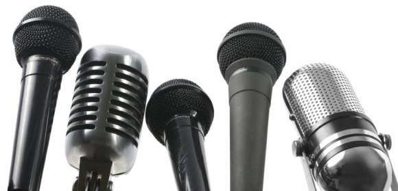
First, we briefly looked at different types of microphone. There are several types, each ideally suited to different usages in different environments. For example, a unidirectional microphone would be ideal for interviewing an individual person – it only records the sound from a certain direction, cutting out background chatter or interference from other noises. However, a omnidirectional microphone would be best for group interviews or covering a sporting event where the whole experience needed to be recorded.

different-types-of-microphones

Some microphones have different power requirements. Most modern equipment can run on what is known as ‘phantom power’ – meaning it doesn’t need to be plugged into an external electrical socket. It can draw power from the equipment that it is plugged into, for example a video camera or computer. However, older equipment and some powerful microphones do require a separate power source.

We discussed best practice for recording sound. Things to consider include the file format to record in – MP3 is heavily compressed, whereas WAV is a higher quality. It is also important to ensure that he correct gain level is set, and to ensure that an even sound level is recorded. For example, if the recording will feature both talking and shouting, the gain should be turned down during the shouting sections.

hero_program-sound-design

After the theory section, we started work using Logic Pro X, a professional piece of sound recording and editing software. We imported our sound recordings that we recorded at the beginning of the lab, and began arranging them on the timeline. We also experimented with using the in-built Apple Loops, as well as changing the volume and pan on different channels. Despite sounding quite strange as it includes recordings of a lift and doors slamming, I am quite pleased with the final outcome!

References and Further Reading:


Categories
Blog

Blog: Lighting

01/11/16 – Lighting

In today’s lab we discussed white balance, colour temperature and different lighting techniques and styles. Using a set of Dedo lights to create a standard three-point lighting setup, we experimented with changing the white balance on the Sony FS-7 camera. We had already learned last year that bright sunlight on a clear day has a high colour temperature of around 6,000K, shade on a clear day has a colour temperature of 10,000K, and a candle has a significantly lower colour temperature of around 1,500K, with a range of values in between for a cloudy day, as well as tungsten and incandescent bulbs. Vhanging the colour temperature can also achieve some cinematic effects.

3fab972e-8a5a-4a7f-b951-86897b81561e-3545-0000031306e9c1ac_tmp

We appreciated that when changing the colour temperature, our eyes have the opposite effect to the camera. For example, when filming outside on a clear day with a colour temperature of around 6,000K, but trying to replicate a late evening colour temperature, we initially expected to have to decrease the white balance to achieve the effect. However, the camera works in the opposite way to our eyes, and in fact the while balance would have to be increased – around 10,000K would be suitable.

dedolight

We also learned about how coloured gels can be used over the lights to compensate for a wrong white balance, or when filming at the wrong time of day. For example, the Dedo lights have a colour temperature of 3,200K. To achieve a neutral colour balance, a white balance of 3,200K would also need to be used. However, if the white balance were increased to 10,000K and a blue gel applied to the lights, a neutral image is also given. The opposite also works: an image filmed with a low white balance, along with orange gels on the lights, also produced a neutral image.

References and Further Reading:

Categories
Blog

Blog: Creativity

25/10/16 – Creativity

Today’s lab was designed to make us realise that we are all creative people. The lab was split into two main sections -the first part was mainly audio. We were played two sound clips which had been found on the internet. These clips were quite different from each other, and we were asked to close our eyes and let the music conjour up some images in our mind, and then write them down.

The first clip was very fast paced and upbeat. For me, the first section of the music sounded like several things zooming past. Coupled with several sci-fi sound effects, I was imagining a spaceship chase scene, similar to the one in Guardians of the Galaxy, with several small spaceships pursuing a larger one.

551315f1-f506-4f43-9ca9-31c1d7d92351-2290-000001d46c8ec705_tmp

The second clip was slower, and immediately I thought of a coastal or seaside town. The main character of an action story, such as 007, was sat at a beach bar slowly sipping a drink at the end of the movie. Then there was a slow montage of the town, showing where the action took place, as the end credits began.

These were just my thoughts – it was really interesting to hear what everyone else thought about upon hearing exactly the same music, and we discussed and explored the differences between male and female thoughts, and whether how much we had travelled could affect our thought processes.

The final stage of the lab was about words. We were showed eleven sets of random pairs of words. From the words, we had to write down a new word that sprung to mind straight away. Then once we had eleven new words, we had to create a short story that included all of the words. This was to show that even if we didn’t think we were creative, we had all come up with a unique and original story concept. It didn’t matter particularly that it might not make sense or be a fully thought-out plot.

  • Passion + Newspaper > Fruit
  • Time + Warm > Warner Bros.
  • Sand + Roof > Dunes
  • London + Ring > Olympics
  • Bag + Smooth > Rolling pin
  • Music + Air > Speed of sound
  • Life + Wolf > Jungle Book
  • Friend + Moon > Bear in the Big Blue House
  • Rope + Leaves > Tarzan
  • Clouds + Hammer > Thor
  • Interfere + Wine > Headache

bb011901-3c0c-4068-8010-edca87e2eb3a-2290-000001d2fd936b43_tmp

Fruit and a rolling pin please,” I called to Thor. He was heading to the shops and asked if I wanted anything. He travels at the speed of sound so it’s a lot easier than me making the effort. I was still in bed – I’d been sliding down the sand dunes yesterday and had the worst headache. I switched on the TV: the familiar tune of Bear in the Big Blue House started blasting out. I grabbed the remote. The Warner Bros channel were playing the new Tarzan film, there were highlights from the Olympics on NBC, as well as lots of news broadcasts. I flicked the TV off and grabbed a book instead. Rudyard Kipling’s The Jungle Book. Should be a good read…

References and Further Reading:

Categories
Blog

Blog: Composition

11/10/16 – Composition

In today’s lab, we went over the basics of composition for photography, including techniques such as the rule of thirds, frames within a frame, the Fibonacci spiral, and more. The main task was to go out from Tower C and take a series of photographs on our mobile phones. Each of these had to be around a certain theme: Line, Space, Time, Motion, Volume or Mass, Value, Texture, Colour, Shape.

Below are my submissions for photos in each of the nine categories along with a few notes on why they were taken and how they were edited. They were all taken on my iPhone, and are all square. This fits in with the rest of my photography work from the last academic year, and also with the regular and geometric design of my website. I prefer regular shapes that can be tessellated and arranged in a grid. I briefly edited each one using Adobe Photoshop before uploading them.

Value: This image is edited simply by increasing the contrast levels and decreasing the saturation, to make the numbers on the lock really stand out from the rest of the metal.

Line: For this image, I liked the way the crack drew the viewer’s eye across the entire width. It is a type of line, however it is not uniform and therefore interesting to look at.

Time: For this category, I tried to think outside the box a little. If I stood in the same place, my own shadow on the floor would grow, shrink and rotate over time, in a similar way to the shadow on a sundial moves.

Texture: This image was fairly boring in my opinion, even after increasing the saturation and variance in Photoshop. In order to make it more interesting and visually appealing, I rotated the image round 180 degrees. However, this made the composition not look right, so I then flipped the image about a vertical axis.

Space: The majority of this image is just empty sky. The tall chimney, at an angle, occupies only a small space. I edited the saturation slightly to make the blue more intense- thus giving the impression of nothingness.

Shape: Choosing an image to represent this category was fairly tricky. In the end I settled on this one as there are multiple simple, geometric shapes present. The corner where the wall and floor lines intersect creates interesting angles, as well as the circular ceiling light and cuboidal emergency light on the wall.

Motion: I found this category the most challenging of the whole task. Finding something to represent motion while still being a photograph with a well thought-out composition was difficult, so instead I used an object that most people would be able to readily associate with motion instead. Upon seeing the image, the motion of an opening door springs easily to the mind.

Mass/Volume: I chose this photo for the Mass/Volume category rather than the Colour category because I liked the effect it created, where you can’t tell whether the shape is going inwards or outwards – it is a 3D image without the viewer being entirely sure what they are looking at.

Colour: For this image I created a mask in Photoshop and desaturated the building to a point where it is pretty much a greyscale image. This leaves the plain, unedited blue of the sky as the main feature of the photo. I liked the way there is a very subtle change in the shade of blue from top to bottom.

References and Further Reading: